Shining the light on Dark Mode
Dark mode became a hot topic within email marketing quarters when Apple included it as a desktop email client back in 2018. The fact that it added iOS Mail to the mix a year later - whilst other big-hitters like Gmail followed suit – fuelled even more hype.
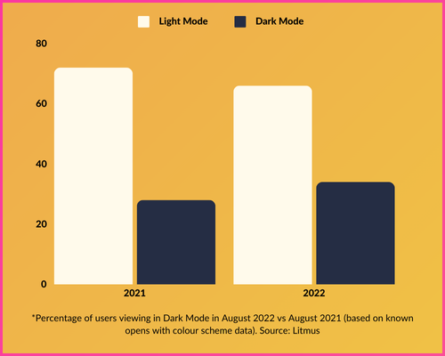
Since then, dark mode has become an ever-present, with Litmus reporting that the proportion of people viewing emails in dark mode soared to 34% in 2022 – up 21% on the year before.
We await more recent figures, but chances are this trend of popularity is unlikely to reverse anytime soon. Bottom line: dark mode isn’t a fad – it’s here to stay. So it’s a bit of a surprise that around 33% of CRM teams don’t even consider it when designing or coding their emails.
Don’t be in that 33%. In fact, don’t just consider dark mode: master it! That’s what we’ll help you do in this guide. But first, a bit of context…
Dark Mode…What and Why?
Dark mode is a user interface setting that displays light-coloured text, icons and other UI elements on a dark or black background. It’s a contrast to the traditional light mode, where dark text is displayed on a white (or light-coloured) background.
This reversed colour scheme is ideal for low-light or nighttime environments, and is widely believed to have significant benefits, including:
Reduced Eye Strain: Dark mode decreases screen glare, especially in low-light environments, making it easier on the eyes.
Improved Battery Life: On OLED and AMOLED screens, dark mode can save battery power since fewer pixels need to emit light.
Accessibility: Dark mode improves accessibility for those with light sensitivity or certain visual impairments, and many other users find it more conducive for consuming content, both on desktop and mobile.
Better for Night-Time: Switching to dark mode can be less disruptive in dark environments, and even support better sleep habits.
The impact of Dark Mode on email marketing
While dark mode improves user experience, it can affect the rendering of email campaigns. The core challenge surrounding dark mode is that it is an end user setting which is selected at device level, so ESPs don’t have direct control over how (and when) dark mode is implemented.
Emails designed with only light mode in mind can end up looking broken, unreadable or unattractive when viewed in dark mode. Common issues include:
· Logos or images with transparent backgrounds appearing distorted.
· Black text or dark elements becoming unreadable against dark backgrounds.
· Colours and formatting not rendering as expected.
Email branding is often the biggest casualty, as dark mode changes the HTML used to render it in the inbox. Whether it’s as simple as swapping colours in text-only emails (while leaving HTML emails unchanged), or switching all colours in a fully-designed email template, dark mode can result in significant styling inconsistencies.
Here is a basic example of how branding can go wrong in dark mode…
7 Tips for adapting to Dark Mode
It’s best to start thinking about dark mode as part of your email design process, rather than as an afterthought. Here are some useful pointers to help you get on top of things…
1) Prioritise accessibility: Use legible fonts, clear headings and avoid overly complex designs. Accessibility-focused emails will look good in both modes and improve user experience for everyone.
2) Transparency: If your logo or icons have a white or light-coloured background, it is usually best to use transparent PNGs so your images seamlessly blend with the background in both light and dark modes. However, if you do need to use image files with background colours, ensure the image covers the full width of its intended area.
3) Use a light outline: When using dark-coloured text or icons, add a subtle light outline or shadow to ensure they don’t get lost against a dark background. This ensures visibility while keeping the design clean.
4) Text in images: Steer clear of images that feature text, and use actual text instead. This enables full colour inversion, and is preferable in terms of accessibility.
5) Custom code: If you fancy yourself as an email dev, you can use CSS that detects which mode a reader is using, and adjust the design accordingly. The most commonly-used tags for creating custom dark mode themes within the email code are ‘@media (prefers-color-scheme: dark)’ and ‘[data-ogsc]’ – although not all clients/devices support these (find out more in the table at the bottom of this page).
6) Test baby, test: Nothing fancy about it. Test your email rendering in both light and dark mode across multiple platforms, clients and devices to ensure your designs look consistent and professional.
7) Know your clients: There tend to be two types of inboxes: those that make minor changes (or none at all), and those that invert email colours. Below is a graphic showing the main email clients and devices that support dark mode, and how they treat HTML emails. Understanding these variations will ensure you know what to look out for when building (and testing) your emails, and set you on the path to success for mastering the art of dark mode.
Email Dark Mode email client support chart (as of October 2023). Source: Litmus


